|
|
Post by horsegirl182 on Oct 8, 2007 8:29:54 GMT 10
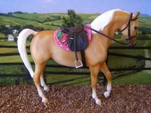
Hi everyone, I just wanted to know what people thought of some of my new showing pics. I know they're cropped pretty close to the horse some of them, but I only have an A3 backdrop poster, which only just fits the horses.. So, any comments apart from the cropping would be greatly appreciated! ;D  Billy Bandit  Bridie's Fire  Le Disko  Mister G  Treibsand (means quicksand)  Playback  Snow Patrol  Painted to a Te - Western Handler/Showmanship  Seattle Gold - english pleasure  Playback - Australian Stock Horse event (no rider)  Playback - Australian Stock Horse event (with rider)  Irrezippable - Western Pleasure |
|
|
|
Post by mistymeadowfarm on Oct 8, 2007 8:32:21 GMT 10
I'm no expert (having never taken a pic of a model horse!) but I really like your background, and your photos are terrific!
|
|
|
|
Post by horsegirl182 on Oct 8, 2007 8:34:44 GMT 10
Thanks! It's a picture I took at my uncle's (stunning) property on Mt Gibraltar, that I got blown up and printed off.  |
|
|
|
Post by Kalysons Park on Oct 8, 2007 8:36:36 GMT 10
Wow that's quite a few pics. I have a comment in my head and then I see another picture and I forget what it was I thought of. lol I think the pics are really good overall. Just watch for fuzzies on the horses, in the pics etc. Oh and the light on the right side of several of the photos, is that natural light or artificial? Cause it is a bit distracting. And also for some models it looks as if you are shooting from underneath them, which gives the effect of them towering over you, particularly in Mister Gs and some other trad pics. But other wise I think they are good! Just the few pics that have the light and such. =] You're models are gorgeous btw.  |
|
|
|
Post by ladyheydonstud on Oct 8, 2007 9:14:58 GMT 10
yes i agree with Kaly.. the lighting from the right is the only thing that could improve in the photo's, because they are really lovely, and compliment the models wonderfully! my fav of the pictures would be miltons |
|
|
|
Post by horsegirl182 on Oct 8, 2007 9:17:24 GMT 10
Thanks for the comments. The light is real, but washes out some of their faces. I'll watch out for that in future. I'm glad you like them. I was a little unsure as to whether the line where grass meets backdrop is too noticeable.. |
|
|
|
Post by horsegirl182 on Oct 8, 2007 9:18:08 GMT 10
Oh, and which do you guys prefer for the Aus. Stock Horse thing.. rider? or no rider? It's for a live show this coming weekend (and another the weekend after that  ) |
|
|
|
Post by Kalysons Park on Oct 8, 2007 9:19:46 GMT 10
IT may be noticable, but what I think, in real life, grass can change almost just like that. I mean in my backyard, during the afternoon the sun makes the houses cast a shadow over the grass so it's going to be darker wheret he shadow is. So I personally wouldn't mark a photo down for that unless it was a really really bad match, But yours are pretty close and it works. I think it does anyway. Oh I like the pic without the rider best. But the one with the rider could probably just be better with a better fitting ofthe rider or maybe fix the baggy clothes. =] |
|
|
|
Post by ladyheydonstud on Oct 8, 2007 9:43:54 GMT 10
i like them both, but if you use the rider, i suggest you lengthen the stirrups (if its possible) because most stockhorse riders have their stirrups extremely long for some reason! i find it so hard to ride in, but oh well! lol. |
|
|
|
Post by horsegirl182 on Oct 8, 2007 11:11:40 GMT 10
I tried shortening the stirrups, but its a Breyer saddle I think, so adjusting them is out of the question without taking apart the whole saddle..  Oh well. lol |
|
|
|
Post by horsegirl182 on Oct 9, 2007 12:39:23 GMT 10
Anyone else? |
|
|
|
Post by mistygal01 on Oct 10, 2007 19:21:12 GMT 10
i really like them, especially the palomino in english tack.......................
|
|
|
|
Post by Kalysons Park on Oct 11, 2007 2:56:07 GMT 10
Yea, I love that saddle! Is that the one you showed us a little while back? Or was that someone else who had a new one....
|
|
|
|
Post by horsegirl182 on Oct 11, 2007 8:40:01 GMT 10
Nup, that was me! |
|
|
|
Post by {broken a.rrow} on Oct 11, 2007 20:10:24 GMT 10
okay, I'm going to give this a go. XD
--
Billy Bandit, Bridie's Fire, Le Disko: All would be acceptable if they wern't so washed out and not in focus to place very high in a class.
Mister G: As above, but the camera angle makes him look over sized.
Treibsand: [love this guy] It's a pretty good photo all around, but near his face it looks a little washed out and the bushes/trees.. are in line with his back (teehee)!
Playback: Washed out around the face.
Snow Patrol: Washed out around the hindquarters.
Painted to a Te: Washed out around the hindquarters.
Seattle Gold: [is it meant to have a rider on it or not?] If it's meant to have a rider, the stirrup flap and stirrup leather should be blu-tacked down (or similar), saddle could be further back so the breastplate doesn't sit incorrectly [too far forward], the stirrup turned sideways to make it look like a foot is sitting in it, the noseband could be slightly lower and the reins look like they're sitting.. wrong. You can also see the blu-tac/wax holding the bit. Again, the picture is washed out.
Playback: Washed out, [and if it's meant to have a rider]saddle could be further back so the breastplate doesn't sit incorrectly [too far forward], stirrup needs to be turned out and reins could be shorter. Again, wax/blu-tack noticeable.
Plaback: Washed out, rider could sit deeper [if possible], saddle could be further back so the breastplate doesn't sit incorrectly [too far forward], shorter reins and noticeable blu-tack/wax.
Irezippable: Washed out, cropped a little short and the photo would look better if taken at the horse's level.
oh I'm so mean.. XD [/font] |
|


 )
) Oh well. lol